

Towers Restoration & Cleaning
A tower with a stronger silhouette.
Build the mark around the name.
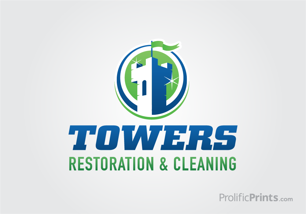
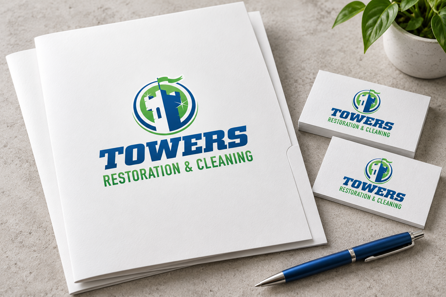
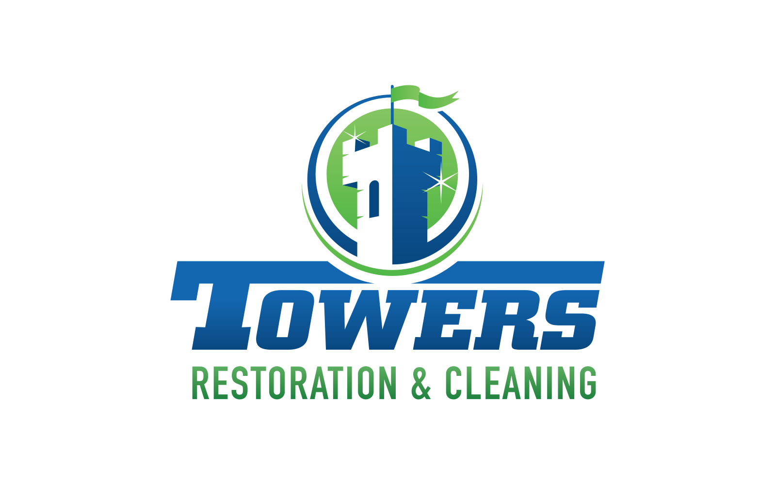
A tower stands at the center of the identity, topped by a green flag. The vertical silhouette gives Towers a straightforward visual signature.
Frame it with movement.
Blue and green curves surround the tower in an open circle. The frame brings the two brand colors together without closing off the symbol.
A wordmark with presence.
Bold, angled Towers lettering sits beneath the emblem. Its weight gives the name a firm base and balances the tall symbol above.
Make room for the full service.
Restoration & Cleaning appears in a separate green line. The complete business description stays part of the identity rather than being lost in the illustration.
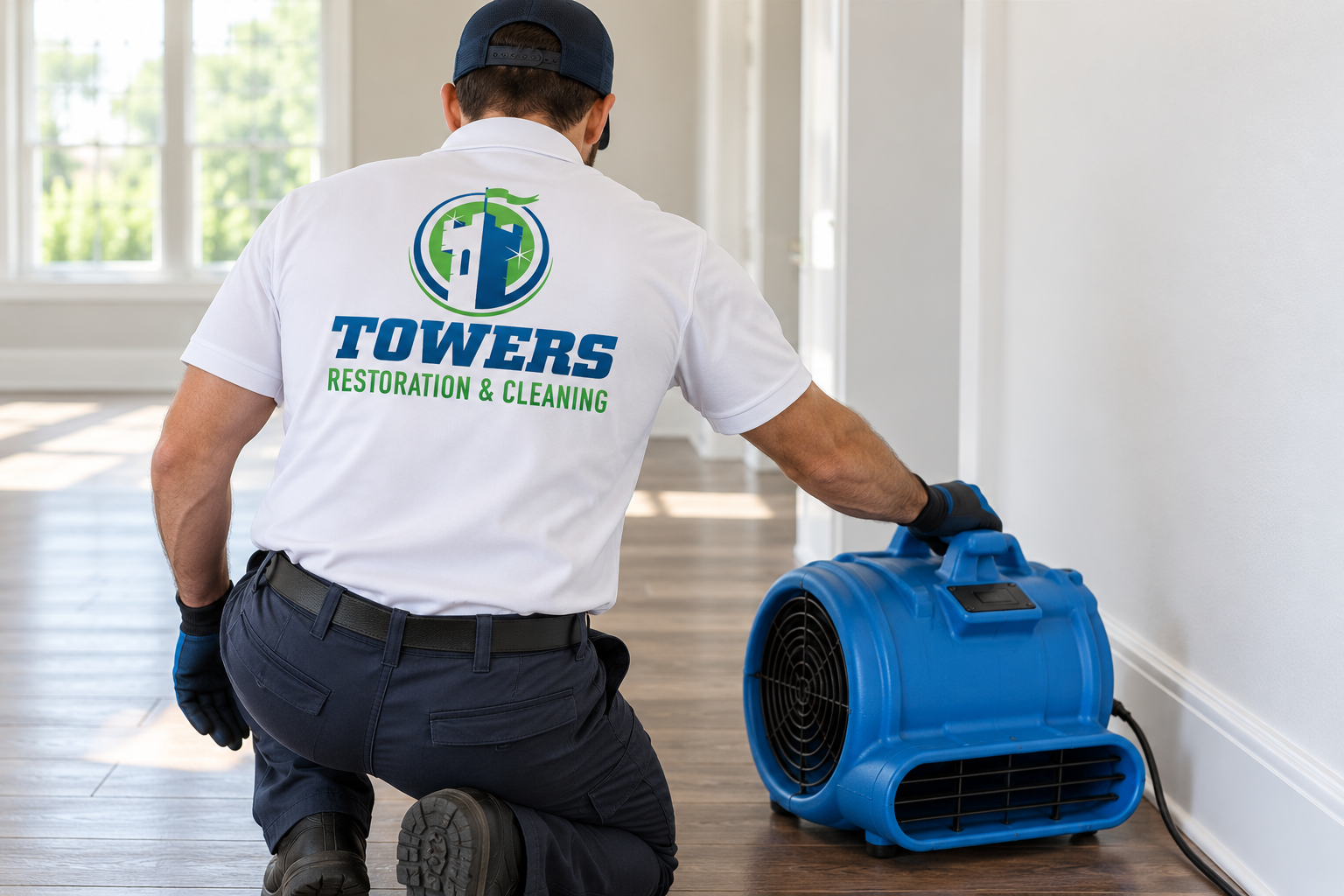
Additional brand applications are illustrative concepts.
Want a brand like this?
Talk with our team about your brand and the right next step.
Schedule a Call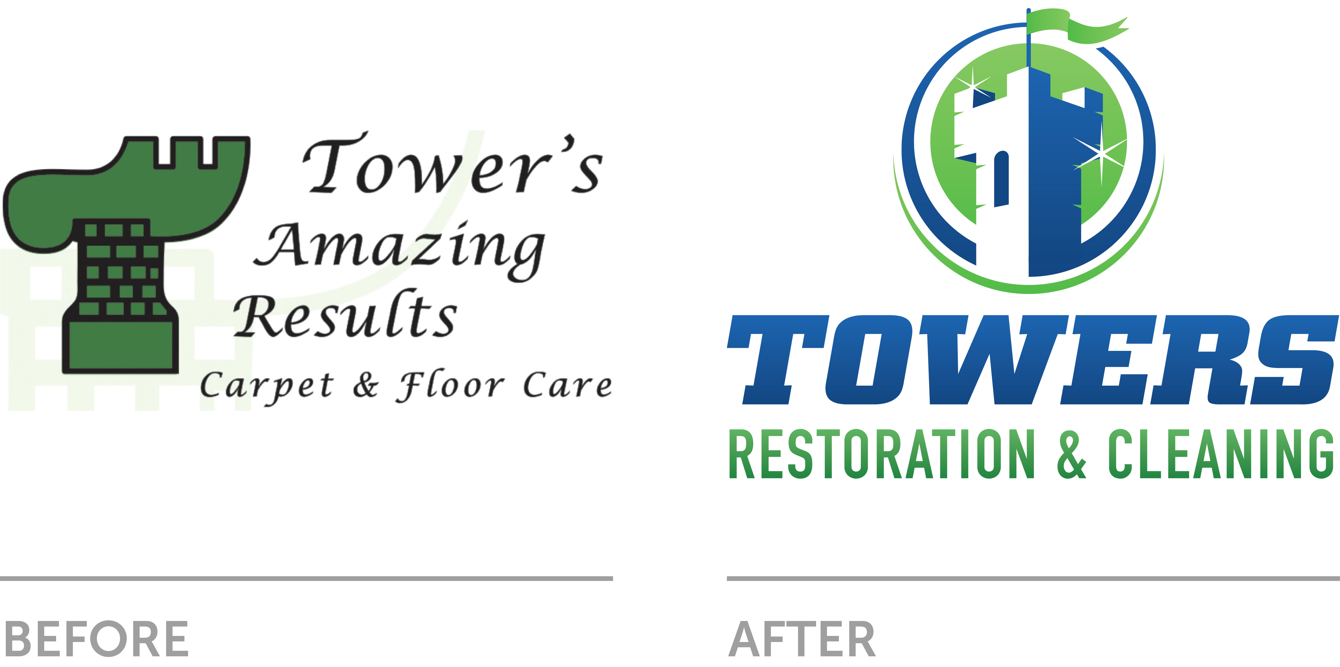
Build the mark around the name.
A tower stands at the center of the identity, topped by a green flag. The vertical silhouette gives Towers a straightforward visual signature.
Frame it with movement.
Blue and green curves surround the tower in an open circle. The frame brings the two brand colors together without closing off the symbol.
A wordmark with presence.
Bold, angled Towers lettering sits beneath the emblem. Its weight gives the name a firm base and balances the tall symbol above.
Make room for the full service.
Restoration & Cleaning appears in a separate green line. The complete business description stays part of the identity rather than being lost in the illustration.
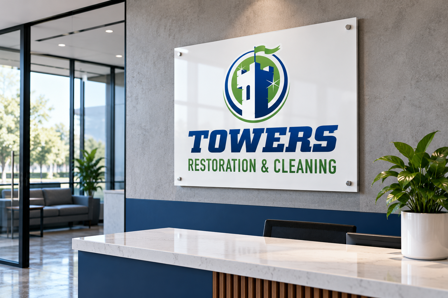
Additional brand applications are illustrative concepts.