

Michigan Paint Co
State pride, in a painter's badge.
Put Michigan in the mark.
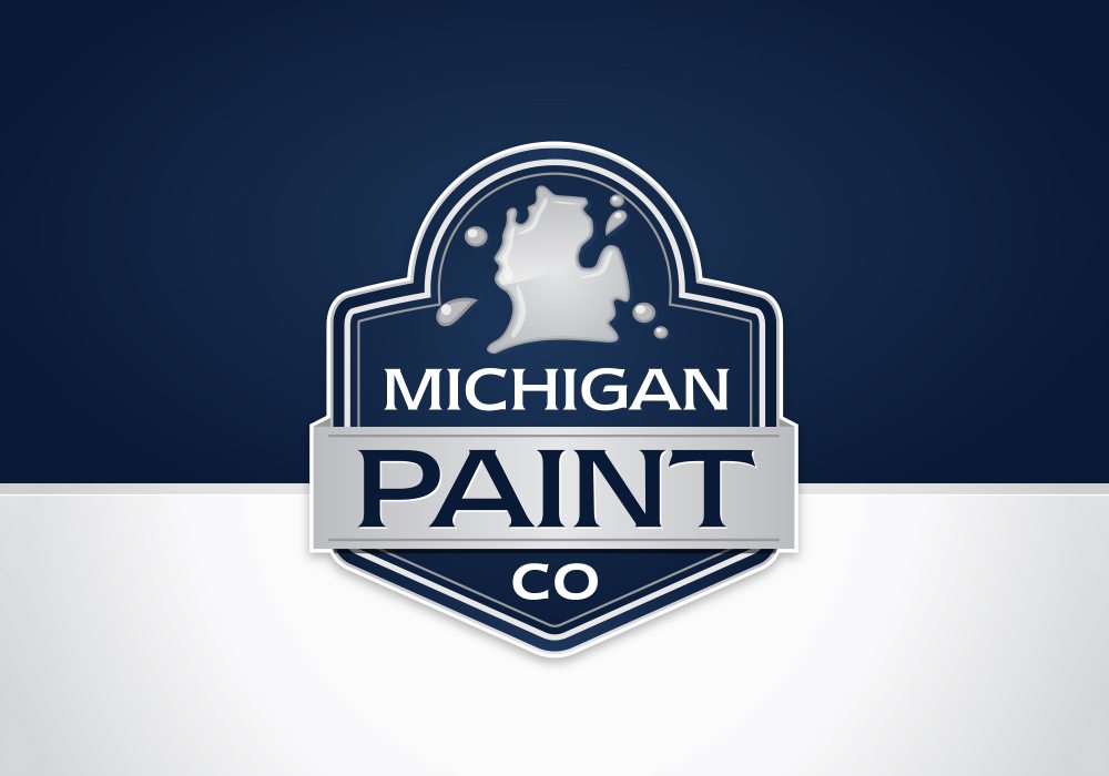
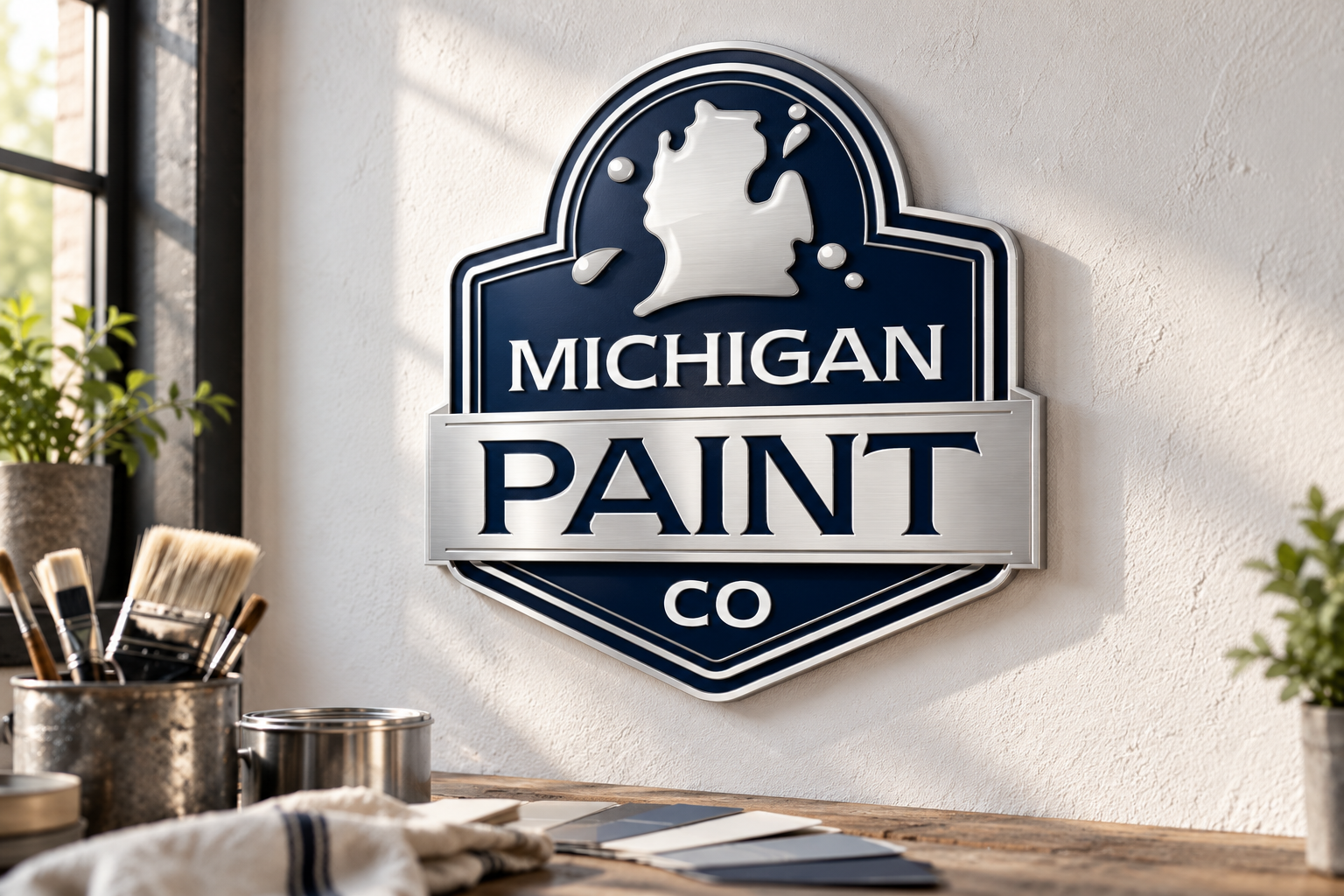
The state's familiar outline appears as a paint splash at the top of the badge. Location and trade come together in one small detail.
Give Paint the center.
A broad band carries the largest word in the logo. Michigan sits above it and Co below, creating a simple three-part hierarchy.
A classic outline.
Layered borders give the badge its shape and depth. The curved top and pointed base frame the lettering as a single unit.
Keep the palette restrained.
Navy, white and silver do the work. The limited colors let the state silhouette and the strong letterforms stay at the center of attention.
Additional brand applications are illustrative concepts.
Want a brand like this?
Talk with our team about your brand and the right next step.
Schedule a Call
Put Michigan in the mark.
The state's familiar outline appears as a paint splash at the top of the badge. Location and trade come together in one small detail.
Give Paint the center.
A broad band carries the largest word in the logo. Michigan sits above it and Co below, creating a simple three-part hierarchy.
A classic outline.
Layered borders give the badge its shape and depth. The curved top and pointed base frame the lettering as a single unit.
Keep the palette restrained.
Navy, white and silver do the work. The limited colors let the state silhouette and the strong letterforms stay at the center of attention.
Additional brand applications are illustrative concepts.