

Clean That Up
Playful lettering. Bright green. A cleaning brand with personality.

A name with personality
Clean That Up’s stacked wordmark turns a straightforward name into a playful identity. Irregular lettering, dots and sparkle details give it a recognizable character, supported by a bright green-and-lime palette.
One identity across touchpoints
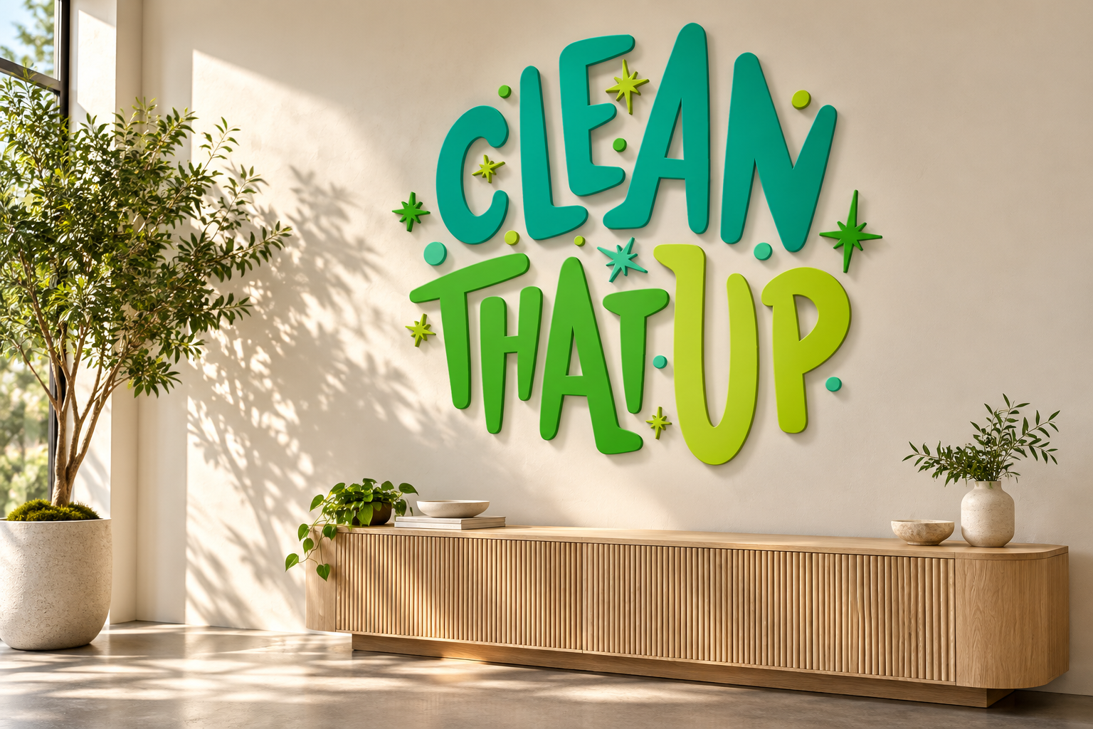
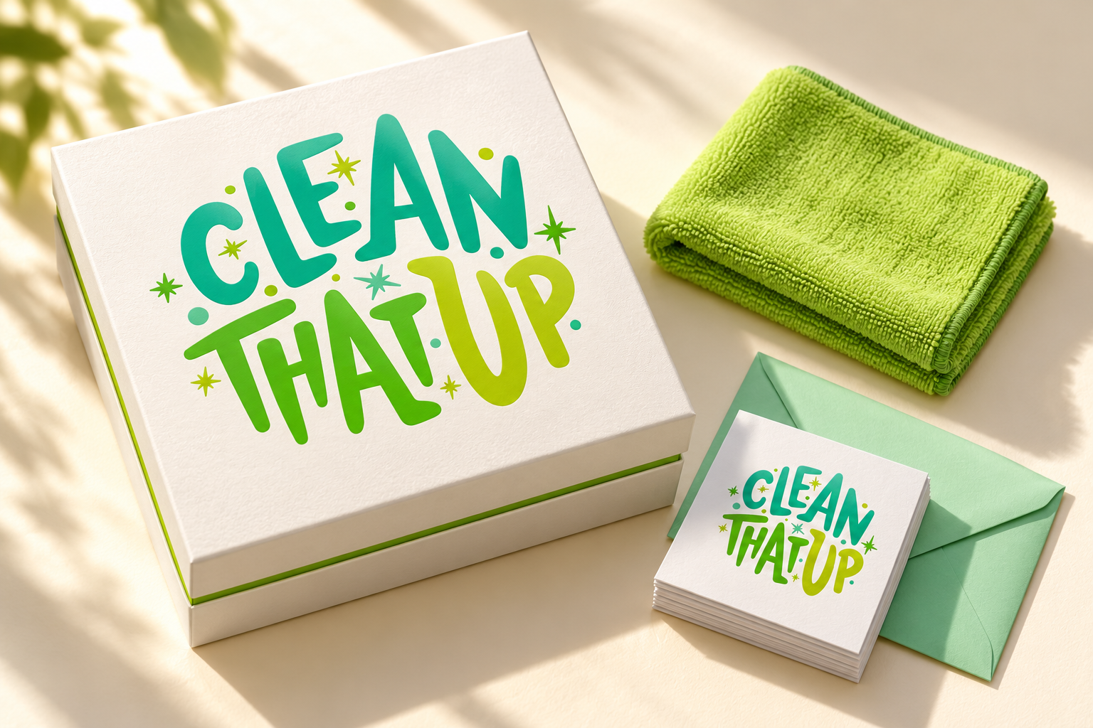
The digital brand mockup carries the same lettering, color and sparkle pattern into a larger composition. The supporting card presentation brings that character into a smaller format, pairing a bold logo face with a clear contact area.
A complete visual language
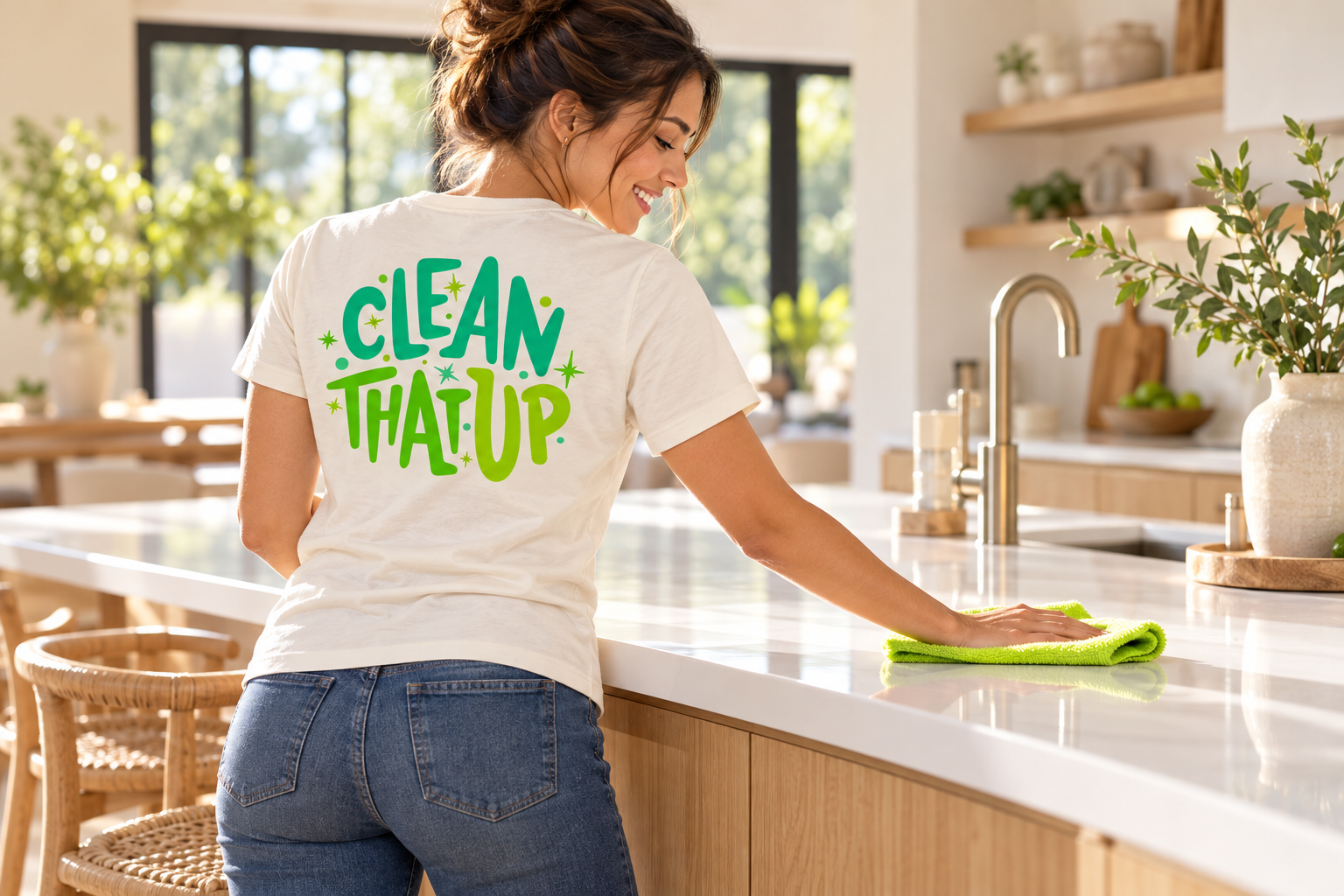
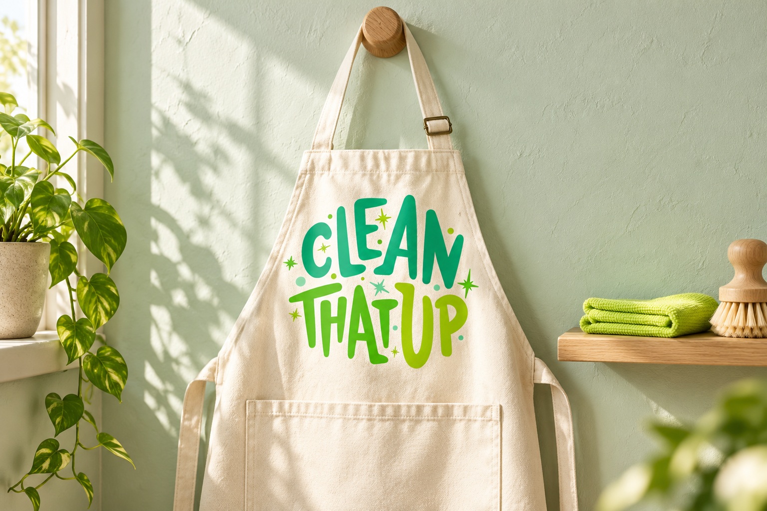
The value is in the connection: the logo, colors, type and supporting graphics feel like one brand wherever they appear. Materials like these demonstrate the wider brand application that sits within the Prolific package.
Want a brand like this?
Talk with our team about your brand and the right next step.
Schedule a Call

A name with personality
Clean That Up’s stacked wordmark turns a straightforward name into a playful identity. Irregular lettering, dots and sparkle details give it a recognizable character, supported by a bright green-and-lime palette.
One identity across touchpoints
The digital brand mockup carries the same lettering, color and sparkle pattern into a larger composition. The supporting card presentation brings that character into a smaller format, pairing a bold logo face with a clear contact area.
A complete visual language
The value is in the connection: the logo, colors, type and supporting graphics feel like one brand wherever they appear. Materials like these demonstrate the wider brand application that sits within the Prolific package.