

Cape Heating · AC · Electric
From a 2020 refresh to a full 2025 rebrand and a new name.
A new chapter for Cape.
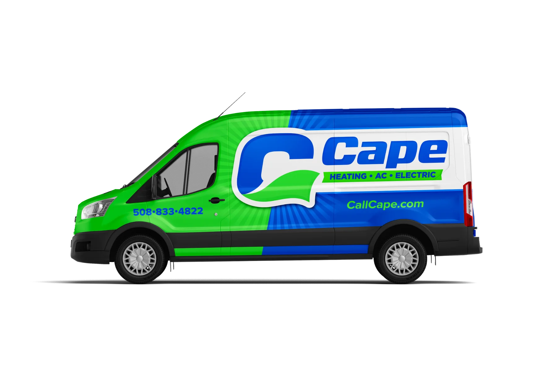
In 2025, we helped Cape Cod Heat Pumps become Cape. The full rebrand paired a shorter name with a caped-C identity, designed to set the business apart in its market. Blue and green connect the new identity across the logo, vehicles and team apparel.
Built to be recognized.
The cape is part of the C itself, giving the name a distinctive symbol that works with the full wordmark or on its own. The current brand brings heating, AC and electric together under the Cape name.
The original identity.
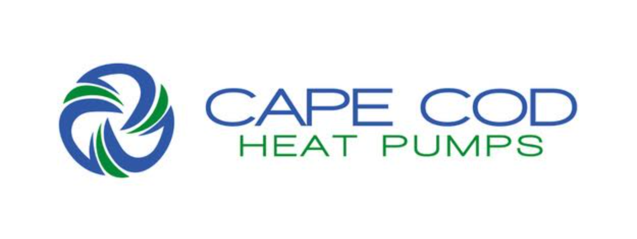
The story began with Cape Cod Heat Pumps and its blue-and-green circular airflow logo. The original logo shown here predates our 2020 wrap update and small rebrand.
2020: a focused refresh.
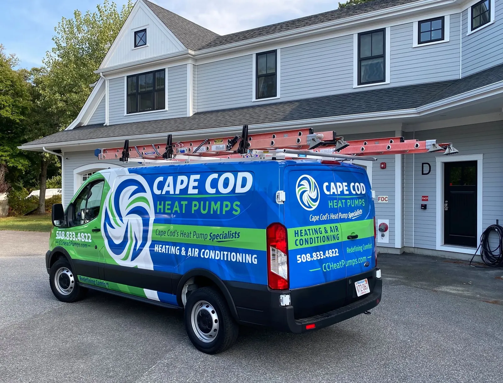
Our first update refreshed the vehicle wrap and made a smaller evolution of the existing brand. Cape Cod Heat Pumps kept its name and airflow symbol, with a bolder blue-and-green presence on the road. The historical van photograph below shows that 2020 identity, not today's Cape brand.
2025: a full rebrand.
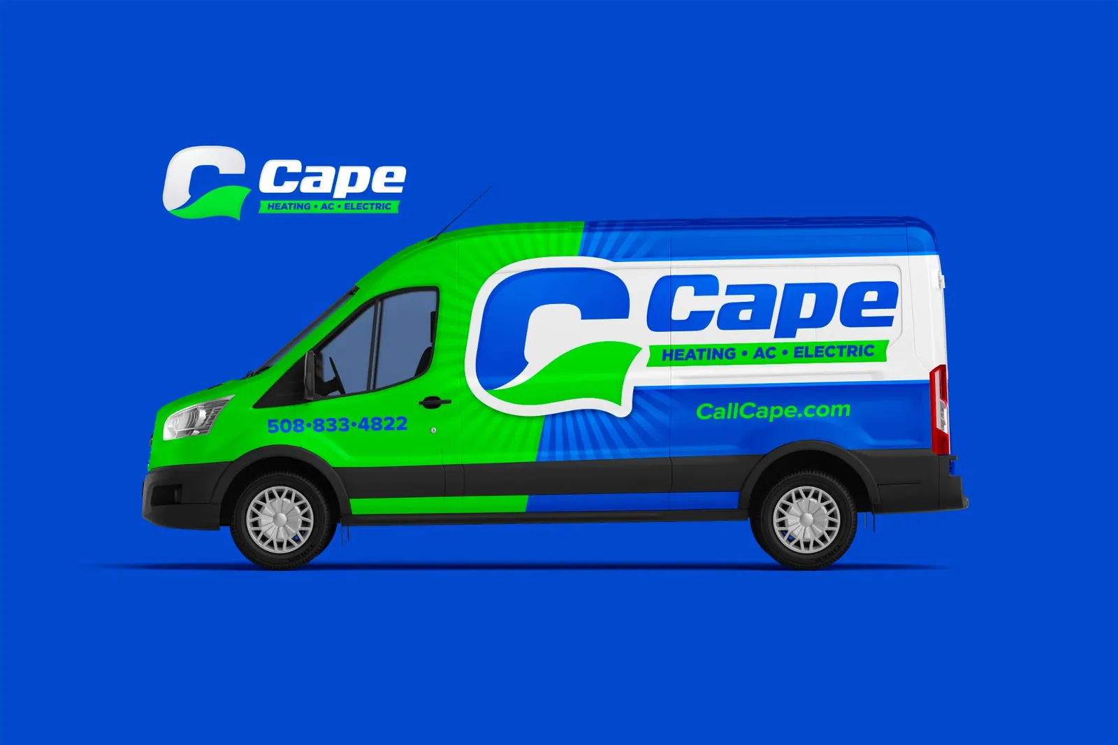
Five years later, we took the brand further with a new name and a complete identity change. Cape's new caped-C mark and updated wrap were designed to make the business more distinct in its market, while keeping a connection through blue and green.
Want a brand like this?
Talk with our team about your brand and the right next step.
Schedule a Call
A new chapter for Cape.
In 2025, we helped Cape Cod Heat Pumps become Cape. The full rebrand paired a shorter name with a caped-C identity, designed to set the business apart in its market. Blue and green connect the new identity across the logo, vehicles and team apparel.
Built to be recognized.
The cape is part of the C itself, giving the name a distinctive symbol that works with the full wordmark or on its own. The current brand brings heating, AC and electric together under the Cape name.
The original identity.
The story began with Cape Cod Heat Pumps and its blue-and-green circular airflow logo. The original logo shown here predates our 2020 wrap update and small rebrand.
2020: a focused refresh.
Our first update refreshed the vehicle wrap and made a smaller evolution of the existing brand. Cape Cod Heat Pumps kept its name and airflow symbol, with a bolder blue-and-green presence on the road. The historical van photograph below shows that 2020 identity, not today's Cape brand.
2025: a full rebrand.
Five years later, we took the brand further with a new name and a complete identity change. Cape's new caped-C mark and updated wrap were designed to make the business more distinct in its market, while keeping a connection through blue and green.