

Anderson Lock & Safe
An A. A padlock. One unmistakable mark.
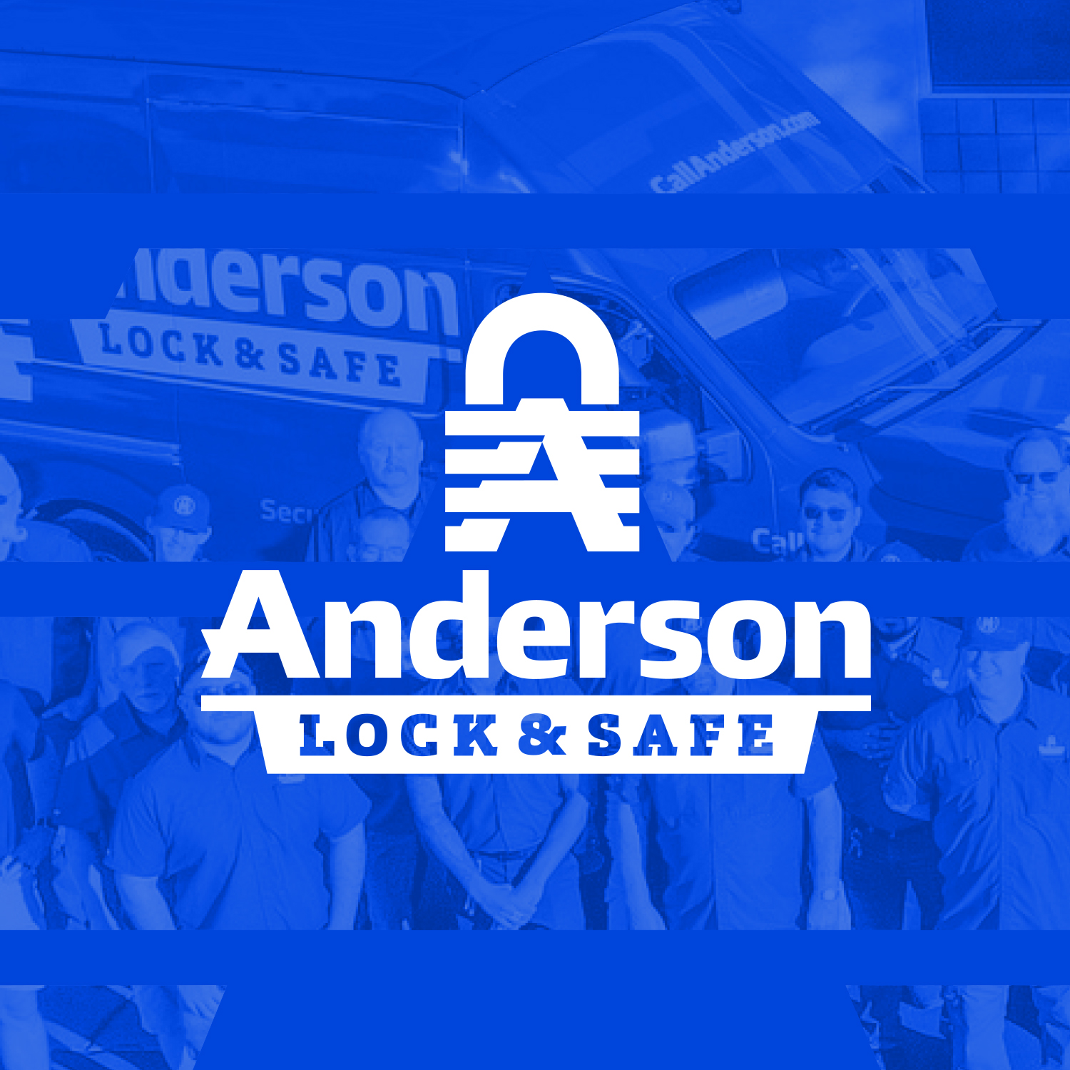
Security starts with the symbol.
The Anderson Lock & Safe mark brings a padlock and the letter A together. The business name and the work it does share one compact shape.
A name with weight.
Heavy lettering anchors the symbol, while Lock & Safe sits in a banner underneath. The hierarchy keeps the company name first and the trade close behind.
Blue. White. Nothing extra.
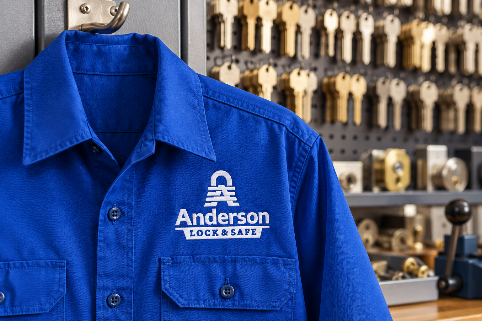
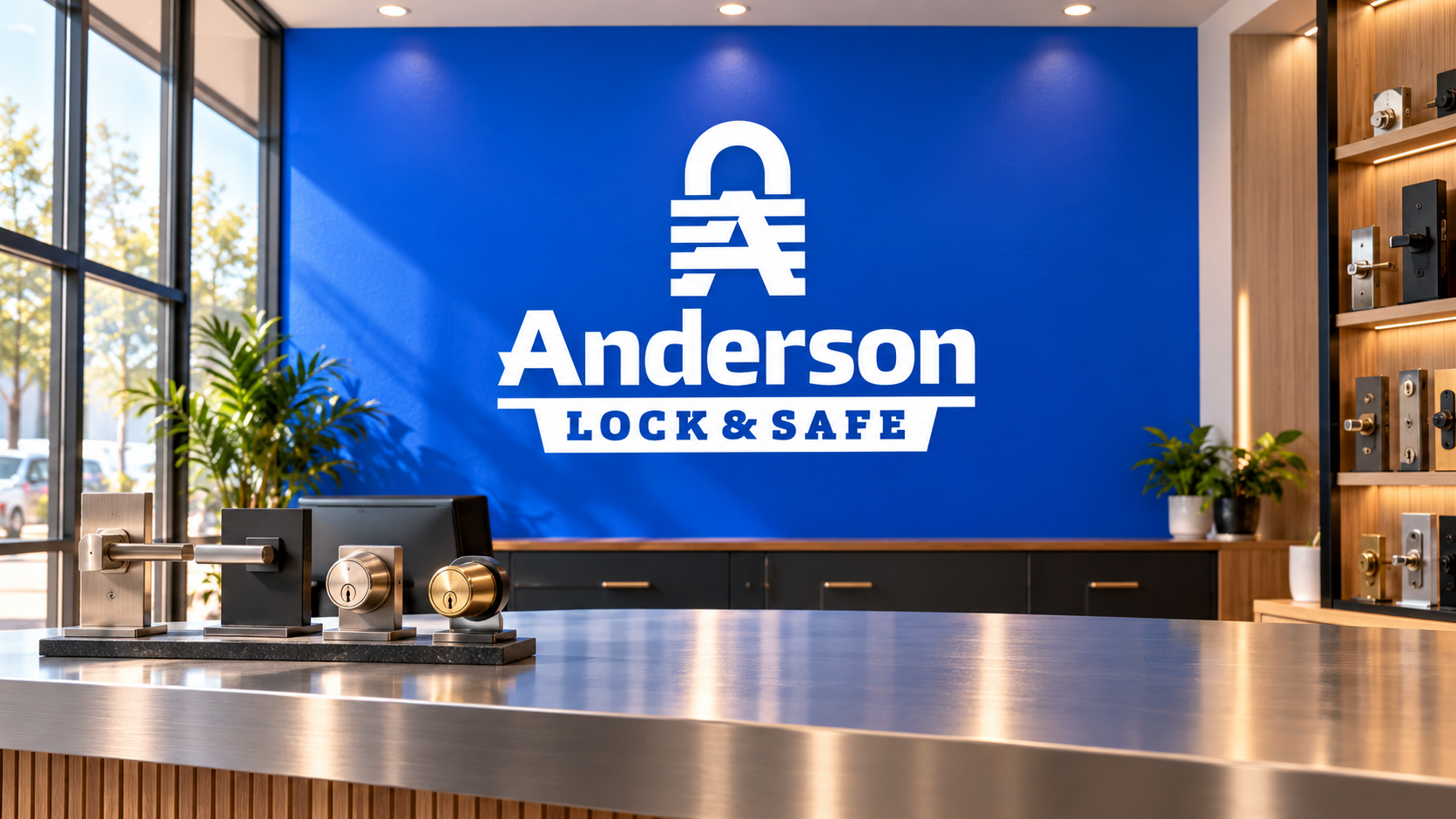
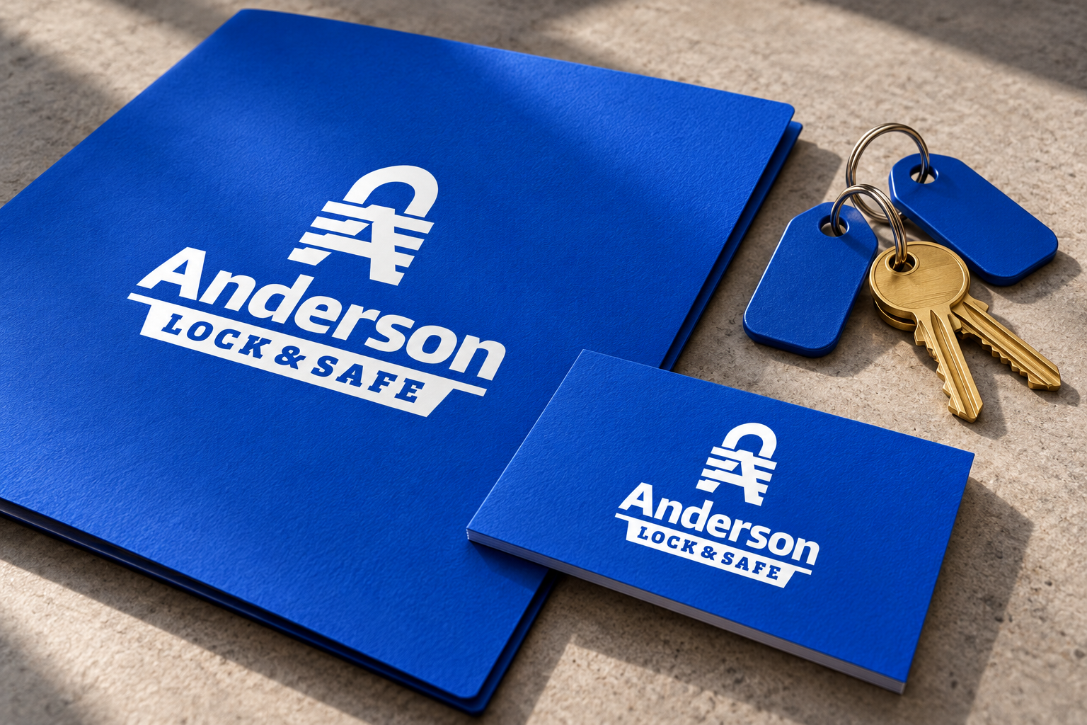
The presentation uses white artwork against a strong blue field. Contrast does the work, with no need for gradients or a second accent color.
One identity, held together.
The symbol, name and service line form a self-contained lockup. Each element has its place, and the finished mark feels solid from top to bottom.
Additional brand applications are illustrative concepts.
Want a brand like this?
Talk with our team about your brand and the right next step.
Schedule a Call
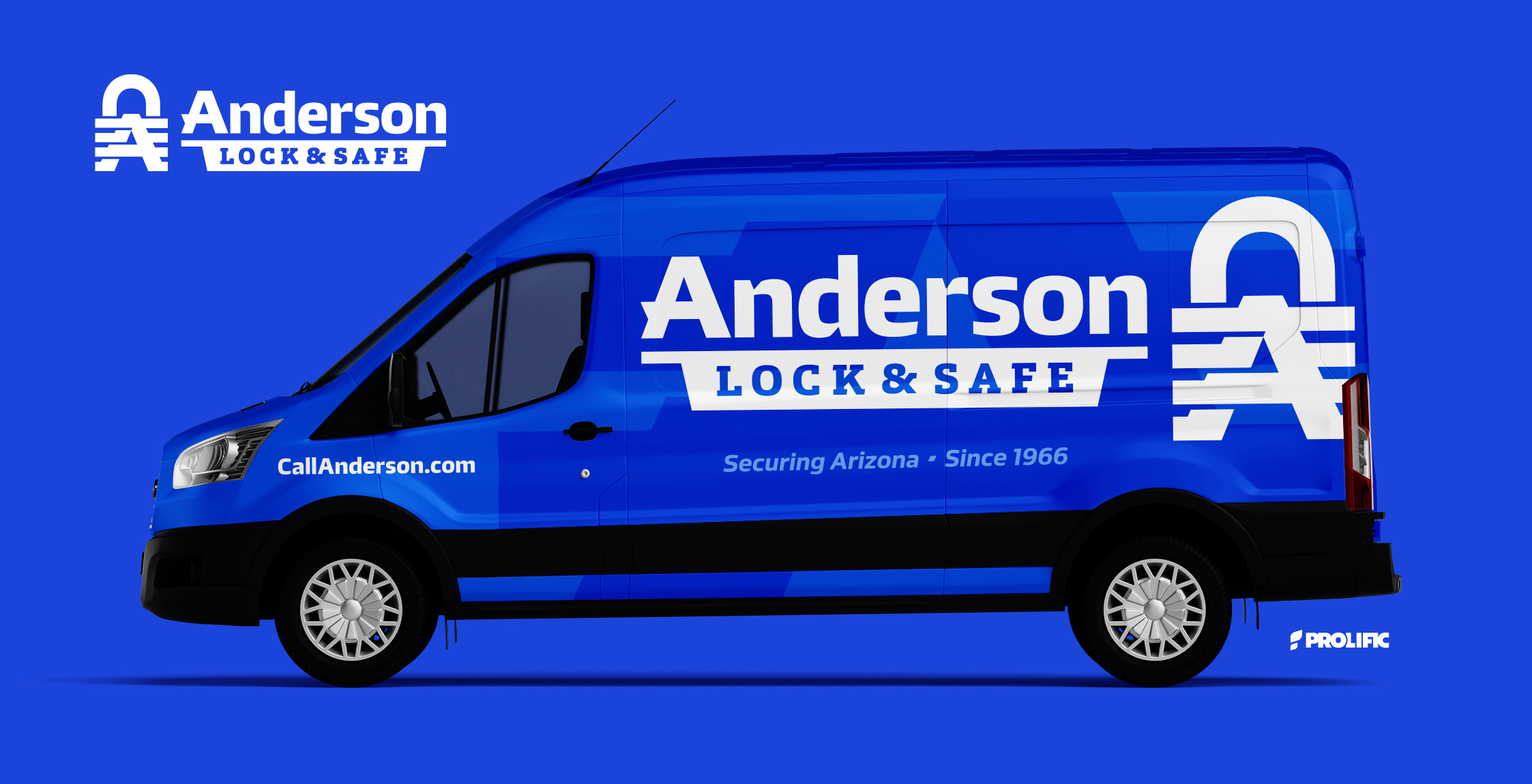
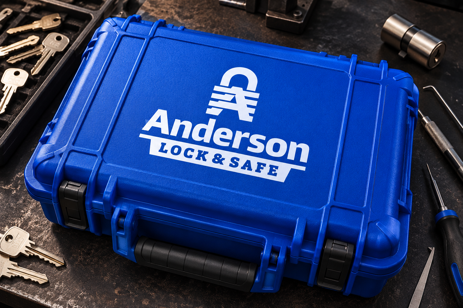

Security starts with the symbol.
The Anderson Lock & Safe mark brings a padlock and the letter A together. The business name and the work it does share one compact shape.
A name with weight.
Heavy lettering anchors the symbol, while Lock & Safe sits in a banner underneath. The hierarchy keeps the company name first and the trade close behind.
Blue. White. Nothing extra.
The presentation uses white artwork against a strong blue field. Contrast does the work, with no need for gradients or a second accent color.
One identity, held together.
The symbol, name and service line form a self-contained lockup. Each element has its place, and the finished mark feels solid from top to bottom.
Additional brand applications are illustrative concepts.